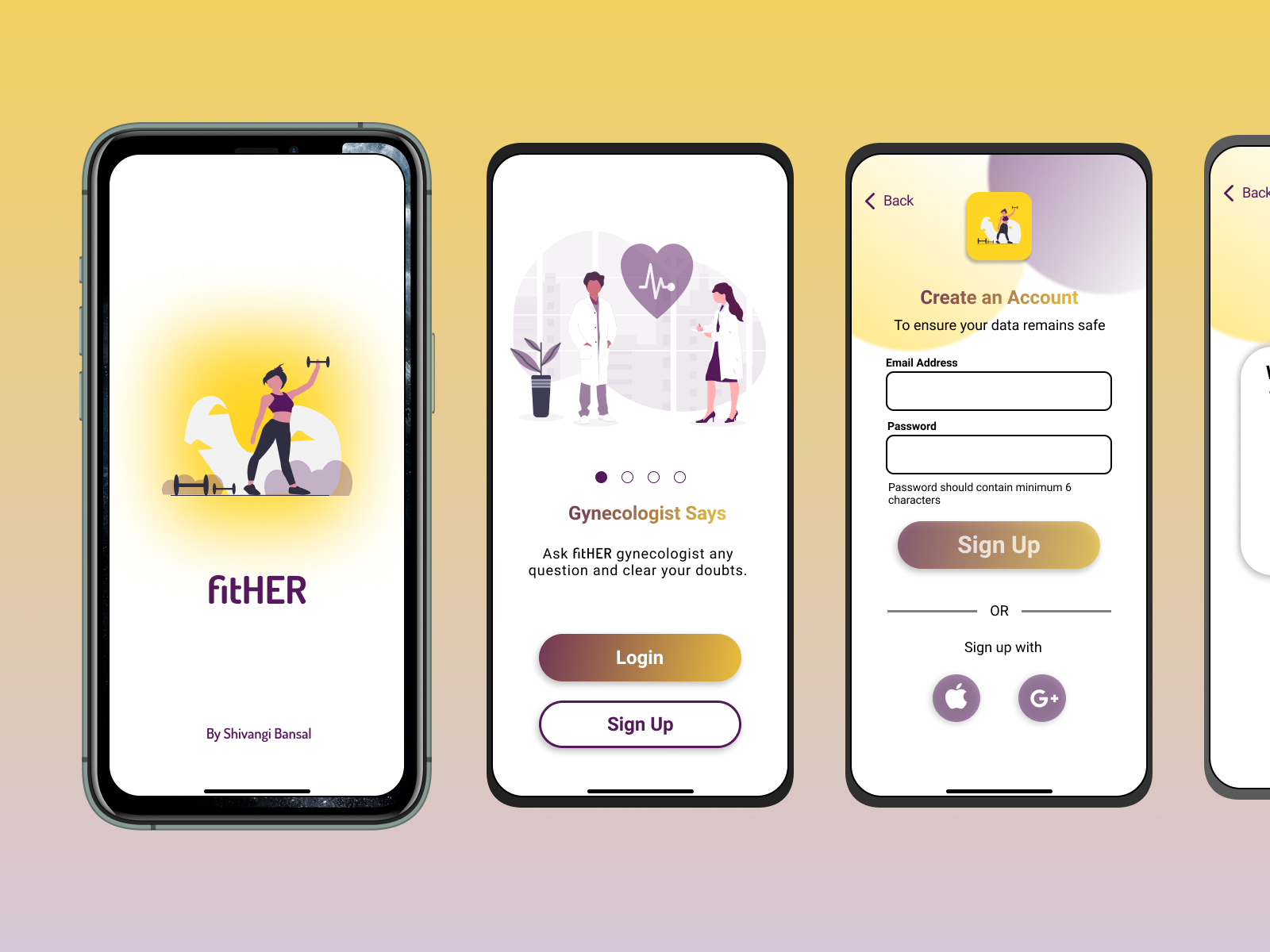
Fit Her
Problem Statement:- is most of the females have to use multiple apps to track their fitness activity, do workout, exercises, menstrual cycle & meal planning. Users loose interest after a while as they find it very cumbersome to use different apps and keep track of it.
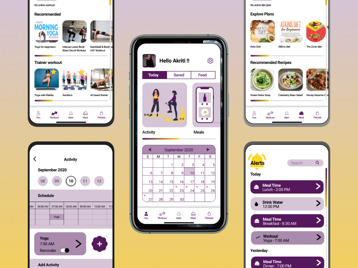
Solution :- to the above is and mobile application that will help users keep track of their health, hygiene and fitness through a single app (activity, meal, periods, workout. etc.) and stay aware and motivated specially during their menstrual cycle.
1. Competitive Analysis
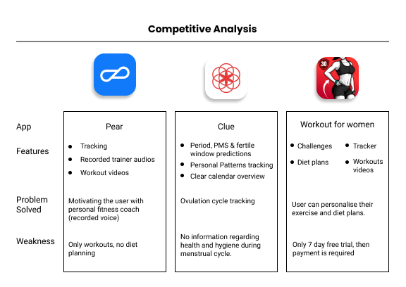
I started of first with Competitive Analysis. I did analysis on 3 apps - Pear, Clue, Workout for women. Details as shown in the image below.
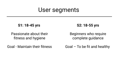
2. Defining Target Users and User Segmentation
Target User :- Women in age group of 18-55 yrs who are Health conscious. To have a system that motivates regularly to be consistent and promotes fitness and hygiene.
3. User Research
3.1 Interview Questions
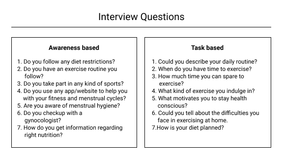
Based on the target user defined earlier, I recruited 4 personas and conducted interview session with them to understand their lifestyle, difficulties they go through to keep themselves fit, what are their aspirations and what motivates them to be consistent. My questions were based on awareness and task based.
3.2. Persona Board
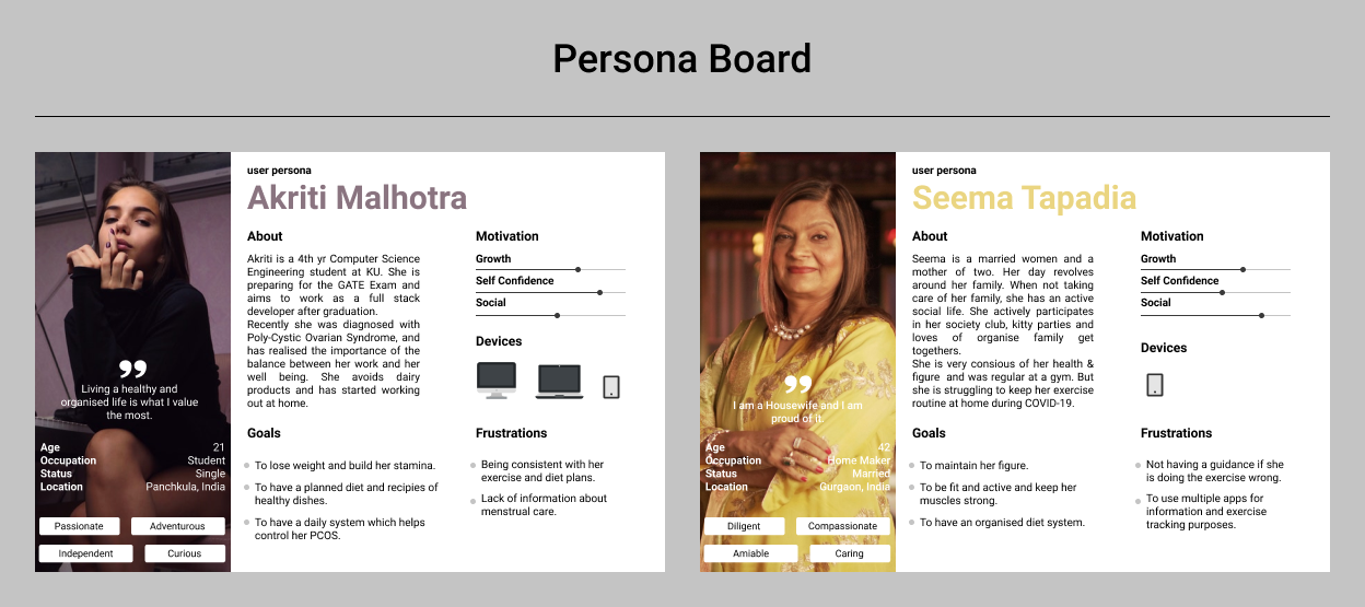
I shortlisted 2 users to create the persona board. This exercise helped me understand clearly what are their motivation, frustration, goals & expectations also about their lifestyle.
3.3. Empathy Map
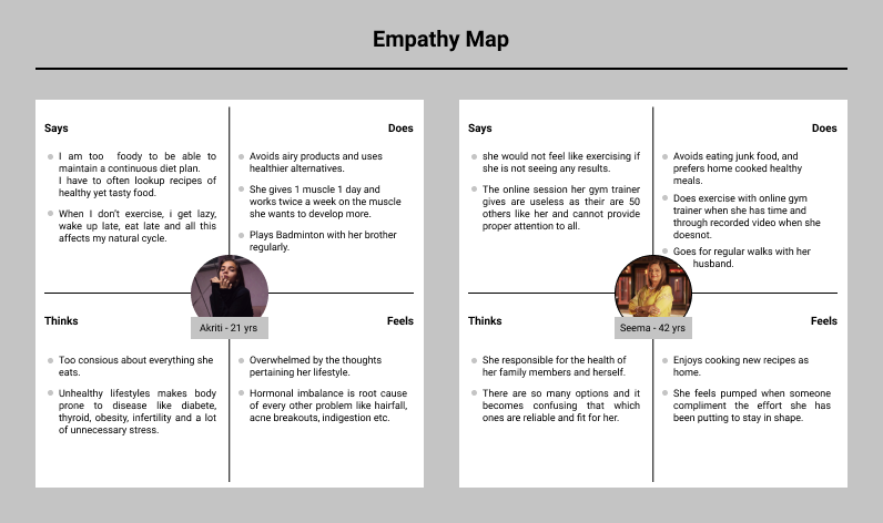
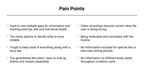
Empathy map helped me to understand what users says, think, feels and do, which gives me their pain points.
3.4. Customer Journey Mapping
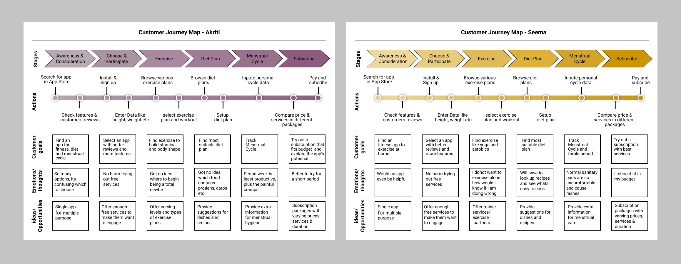
This journey helped me understand where users are facing problem and numerous opportunities at different touch points to solve those problems, which gives a list of features that I can have in the app to improve the user’s experience.
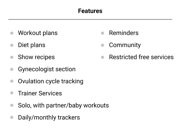
After completing customer journey map for all the users, I put together a list of features for the target app.
4. Information Architecture (IA)
I performed card sorting to understand which feature fits best under which
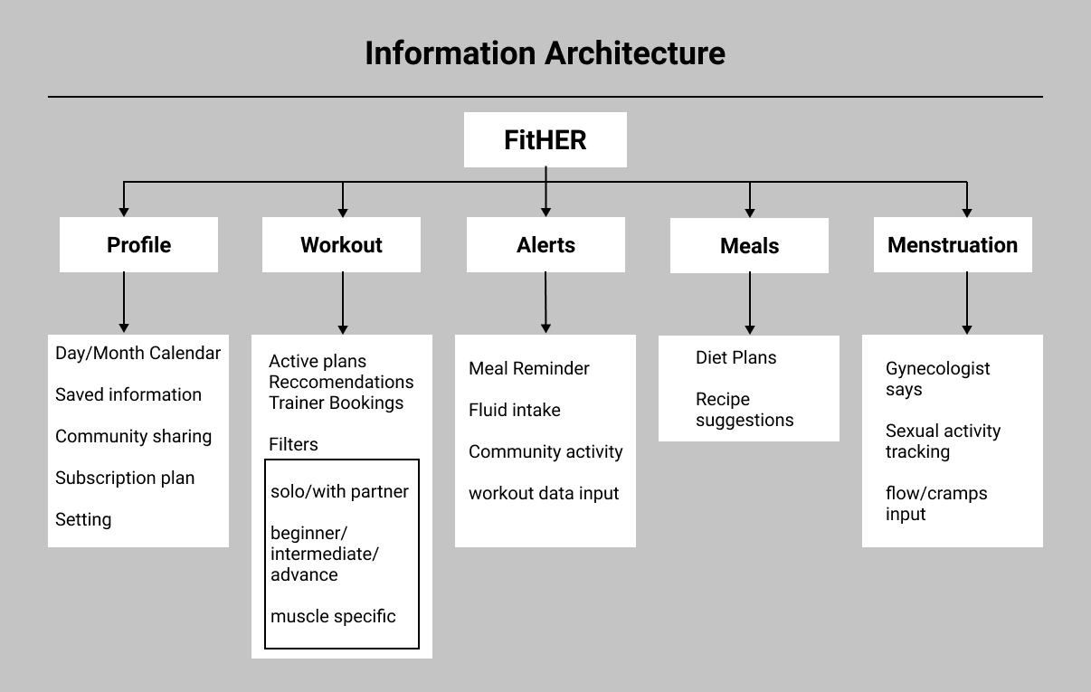
section.
5.1 Low Fidelity wireframe
I started with basic level wireframe with help of balsamic tool. In this I worked out the placement of containers, buttons, cards etc.

5.2 Mid Fidelity Wireframe or Digital Wireframe
In this journey I tried to be as detailed as possible, from navigation, icons, touch
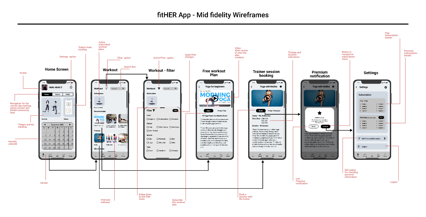
points.
6. Interactive Prototype
I used Invisionapp to create interactive prototype. It is very simple to use application.
7. Usability Testing
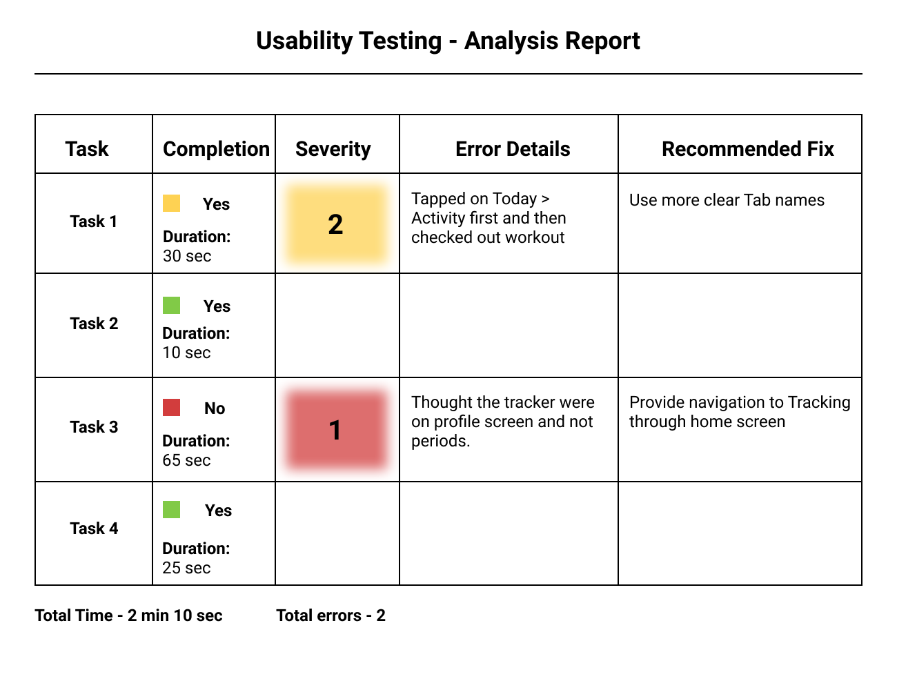
I conducted usability testing by sharing the prototype link with users and asked them to perform few task.
The list of tasks were:
- Task 1 :- Subscribe the free yoga plan.
- Task 2 :- Check your today’s tasks to be completed.
- Task 3 :- Add cramps tracking to your trackers.
- Task 4 : Save a drink’s recipe.
Based on the testing Usability Analysis Report was generated as in the image below.
8.Style Guide
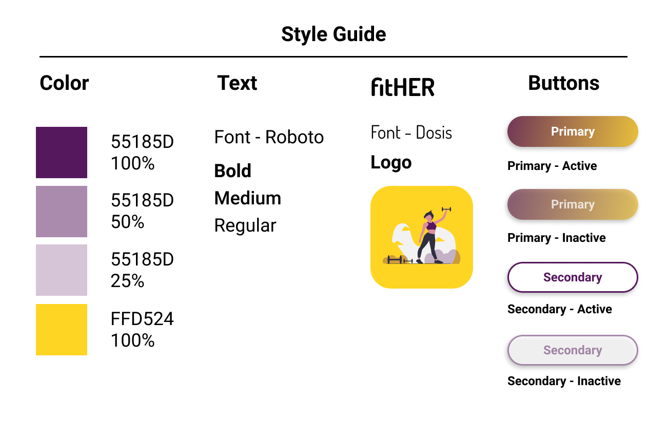
Here is the style guide to fitHER which includes the color styles, text styles, buttons and logo.
After usability test I worked on the issues faced by the users and tried to fix them. Finally I have the finished prototype of an app that user can happily use on a daily basis.
